Pinterest design tips to dazzle your fans and grow your brand
Table of Contents
A Pinterest account’s potential lives and dies on its pin design, yet staring at a blank canvas or the wall of beautiful pins already on the platform can make you feel like a deer in the headlights. Hold onto your laptop, because we’re going to blast through that feeling with Pinterest design tips and best practices that will prepare you to dazzle the fans awaiting you on the platform.
Guide to Pinterest design tips and best practices
Related: The entrepreneur’s guide to Pinterest marketing
Why does pin design matter?
When someone hires me to help them improve their Pinterest account, the first three things that I look at are (in this order):
- Account set-up
- Pin optimization
- Pin design
Optimization and account set-up determine how many people see a pin, and pin design determines if the user saves, clicks or (the horror) keeps scrolling.
As for amazing Pinterest pin design? You’ve found your roadmap. And it’s a good thing you’re here.
Everyone loves to blame the algorithm when their content isn’t performing well. Sometimes the algorithm does cause mysterious dips and shifts, but when your content doesn’t look the part, you need to be looking for solutions and opportunities to improve.
Pinterest is a visual platform. A Pinterest user decides whether or not to engage based solely on how a pin looks.
Yes, pins have titles and descriptions. But can you remember the last time you read one? Users don’t read the details of pins. They scroll, so all of your opportunity to capture attention boils down to how your graphics look.
There are huge opportunities at stake here.
Most users mistake Pinterest for a social media platform, but it’s actually a search engine. Think of it as Google’s cool cousin, with some pretty unique advantages and opportunities for brands.
On Google, you fight for a page on your website to show up in the No. 1 spot for a search. But can you imagine if your website occupied all three of the top spots? Or all five?
This is the opportunity that brands have on Pinterest.
Pinterest’s search algorithm doesn’t limit how many times a single brand can show up in one search. The secret to dominating search results is to make unique pins that will attract different viewers to click.
Optimize your pins correctly, and you can take home an enormous slice of the pie:

The magnitude of your success on the platform rests on your Pinterest pin design, so let’s discuss fundamentals.
Pinterest design 101
Good Pinterest pin design is all about getting the viewer to click or save your image. But don’t dive straight into designing the snappiest graphics on the web without nailing down the nitty-gritty.
Before getting into some specific do’s and don’ts of Pinterest pin design, let’s talk about the principles of effective design on Pinterest.
Pin format
The recommended Pinterest pin size is 1000 × 1500 pixels. Alternatively, you can also make long pins that are 1000 x 2000 pixels.
Square graphics can sometimes be effective (for example, many quotes and product images are square), but use them sparingly. Never use horizontal images on Pinterest.
Example of a long pin on Pinterest from Loveleigh Loops:
Save your images as PNGs and shrink them using TinyPNG or another lossless image compressor to make your images more efficient.
Give images file names that match their content. For example, “Pinterest marketing pin.png” instead of “my pin.png.”
Originality
Never download images from Pinterest and re-upload them as your own pins. This infringes on other creators’ work and will get your account flagged as spam or suspended.
Stolen or misused content runs rampant on Pinterest, and encompasses:
- Downloading a pin from someone else and uploading it yourself
- Doing this even while crediting the original source
- Creating pins that send Pinterest users to a website that you don’t own (for example: creating pins for an article that you published on Medium)
On top of breaking Pinterest’s Community Guidelines, it undermines your account’s credibility. Only use original images or stock photos that you have the rights to (an important note on using stock photos coming up in a minute).
Clarity
When a Pinterest user sees your pin, they’ll spend milliseconds deciding if your pin can help them or not.
You need to make it abundantly clear what this piece of content offers pinners or you’ll instantly lose them.
Take this example from Sarah Design of a drinkware mockup tutorial:
Even at a quick glance, you immediately understand what this pin is about and can self-select whether or not it can help you. This should be the goal of every pin that you design.
Current trends
On Pinterest, trending topics will arise (who WASN’T making sourdough bread in 2020) but design trends for creators are much less important.
Pins that you make this year will still be circulating in 2025, so don’t marry your Pinterest pin design to trends.
Instead, let’s look at the trends that are specific to Pinterest users.
Seasonal content
Pinners turn to Pinterest for their planning moments, and they turn early. Would it surprise you to learn that Christmas searches start as early as July?
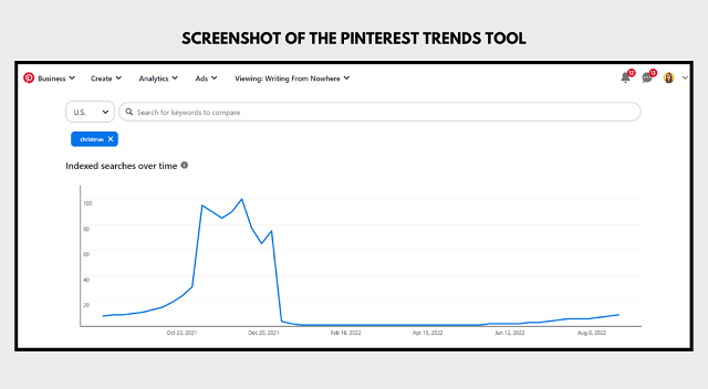
You should produce your seasonal content the quarter before the season itself. Pinners aren’t off-put to see Thanksgiving ideas while they’re still in shorts — they appreciate it.
Big text
The big text trend is a reaction to pinners’ short attention spans. Big text not only jumps out of the feed, but it also forces creators to boil their content down to a few words.
Take this example from The Mindful Mocktail. Instead of saying “the easiest healthy alternative to drinking a raspberry alcoholic margarita,” we have “easy raspberry margarita mocktail.” Boom.
Inspiring images
Pinners open the Pinterest app to plan, learn and be inspired. Tap into this need with your image selection.
Take this example from Grateful Gypsies. We all read the text but feel the imagery.
Imagine those exact same words written on a white page. The effect wouldn’t even be close.
Pinterest design tips for non-designers
Are you thinking, “this all sounds good, BUT…”
Let me assure you: you do not need to be a graphic designer to make Pinterest pin designs that speak to your readers and drive traffic to your website. You just need to create a pin design process that works for you.
Make a mood board
Browse the platform for Pinterest pin designs that you think look good. Then, save them all to a secret board.
Use this secret board as a mood board to find templates that you like, or to send to a graphic designer if you choose to outsource.
Use pin templates
With your mood board in hand, browse Pinterest templates and look for designs that match your branding and speak to your readers.
When editing Pinterest templates, at a minimum, customize:
- Colors
- Fonts
- Images or video
- Plus, add your brand name
These should all match your branding and make your pin look different from the others online created using the same template.
You’ll accumulate more saves, clicks and Pinterest followers if your pins are unique and not a knock-off of what users have already seen.
With these basics in mind, here are some of the top Pinterest pin design secrets that will help you maximize your potential on the platform.
Note: With thousands of customizable templates, GoDaddy Studio is designed specifically to help you easily create gorgeous content in minutes.
Pinterest design tips: Do’s and don’ts
Feeling energized to create pins for your brand? Don’t get lost down the design ideas rabbit hole without sticking to these basic best practices.
Do: Use images that match content
Avoid the urge to use generic attractive images on your pin designs. Image choice plays a large part on Pinterest, both to the user and the algorithm.
The front-end of the Pinterest SEO process is similar to other search engines: you do keyword research, then include those keywords in the pin title, description and file name.
But Pinterest veers away from other platforms with its advanced visual search capabilities.
The Pinterest algorithm is also reading the text on the image, and scanning the image’s contents.
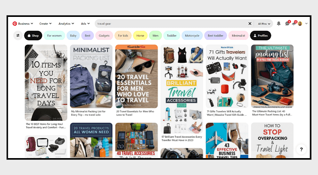
Be specific when you can be. Take this example from Ms Travel Solo. She could’ve shared a generic travel picture for this blog post on travel gear, but instead, she showed pinners the gear itself:
Don’t: Use templates or images that match everyone else
While it’s good to look at what’s already performing well while designing your pins, don’t marry your design process to what you already see or you risk being redundant.
Exhibit A: this popular free stock image. A quick visual search on Pinterest shows that dozens of accounts have used this exact stock image repeatedly, unedited and with no added branding.
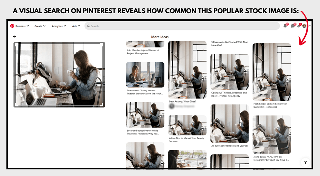
Take the time to customize stock imagery and free Pinterest pin templates:
- Add your brand colors or filters on stock photos
- Change the font to match your branding
- Supplement stock photography with original photography
I know I’m repeating myself, but skipping this step really sets your designs back. And it’s easy to amend.
Take this example from Courtney Kelly, who made her pin stand out by applying a pink filter to this stock photo and supplementing with her own photography:
There’s nothing wrong with using free stock photography in your Pinterest pin design process, but don’t cut corners when customizing them.
Related: How to use a stock photo 8 different ways
Do: Include your branding
This point is so important that we need to zoom in. Including your branding in your Pinterest pin design is a matter of:
- Readers remembering and revisiting your content
- Building a unique visual identity
- Being recognized by the algorithm
Take this example from Inspirational Tea Co. — the branding oozes out of every design element in this pin.
It checks every box while still remaining true to the style of the brand:
- The content is clear
- The pinner immediately understands the call-to-action (shop now)
- The product images shine alongside text
The cherry on top: underneath of this pin, if you scroll down to the “More Like This” section, the algorithm is showing more content from this brand:

Good Pinterest pin design extends a hand to the viewer without making it all about them, which is a common beginner fumble.
Don’t: Make it all about you
Everyone who consumes content online is subconsciously screening for an answer to the question “how can this help me.”
The fastest way to engage with viewers is to absorb the responsibility of communicating that message into your Pinterest pin design. Don’t make them wonder, guess or try to solve the riddle themselves.
Teach from the “you” perspective, not “I.” For example:
- “How I make $100 a day online” is about you.
- “How you can make $100 a day online” is about the pinner, and is going to inherently pick up more traction.
Here’s another example:
- “How I wrote an entire book in 1 month” is about you.
- “Secrets behind writing an entire book in 1 month” is about what the reader can learn.
Take this pin example from Sojournies. This text could’ve read “what I like and dislike about living in Europe” but is about the viewer instead:
If you struggle with this in your Pinterest pin design, ask a friend for a second opinion before you publish your pins.
Do: Add text
This is one of the most overlooked Pinterest design tips. You should add text, even when you’re just using photography.
Text on pins orients pinners and improves click-through rate and pin saves.
Ask yourself which of these pins you would be most likely to engage with:

Even if you’re creating pins that exclusively show off photography, take the time to edit the design using a solution like GoDaddy Studio to add a few words that will orient the pinner.
Take this example from Sisters’ Sunflowers. Instead of simply showing off a standalone sticker image, minimalist text aids viewers in understanding this content.
Text should always be direct and aid in understanding. While you might be tempted to use playful copywriting like “you know you want me,” direct language is going to help users self-select more quickly. Just don’t design pins with text that ends up working against you …
Don’t: Make it hard to read
Text that’s unclear, confusing or difficult to read will cause viewers to keep scrolling. A few rules of thumb:
- Use script fonts very sparingly
- Change font sizes to create a visual hierarchy
- Clarity trumps everything else
Take this example from my brand, Writing From Nowhere. Varying text sizes and fonts create contrast and hierarchy:
The font size varies from 45 points (bottom row of text) to 275 points (the word “winning”). Had all of the text been the same size or all been written in the script font, the lead would’ve been lost.
Final thoughts
Do your pins pass the test? Before uploading to Pinterest, ask yourself:
- Is it instantly apparent what this pin is about?
- Is it easy to read, even on mobile?
- Would I stop my scroll to look at this?
If your pin design is an afterthought, your content will follow suit in the eyes of the pinner. Apply these Pinterest pin design fundamentals to your static pins, idea pins and product pins to see massive improvements to your engagement rate.
I hope that these Pinterest design tips and best practices have left your fingers itching to start designing! Get started right now with GoDaddy Studio.

